Magazine Cover Situational

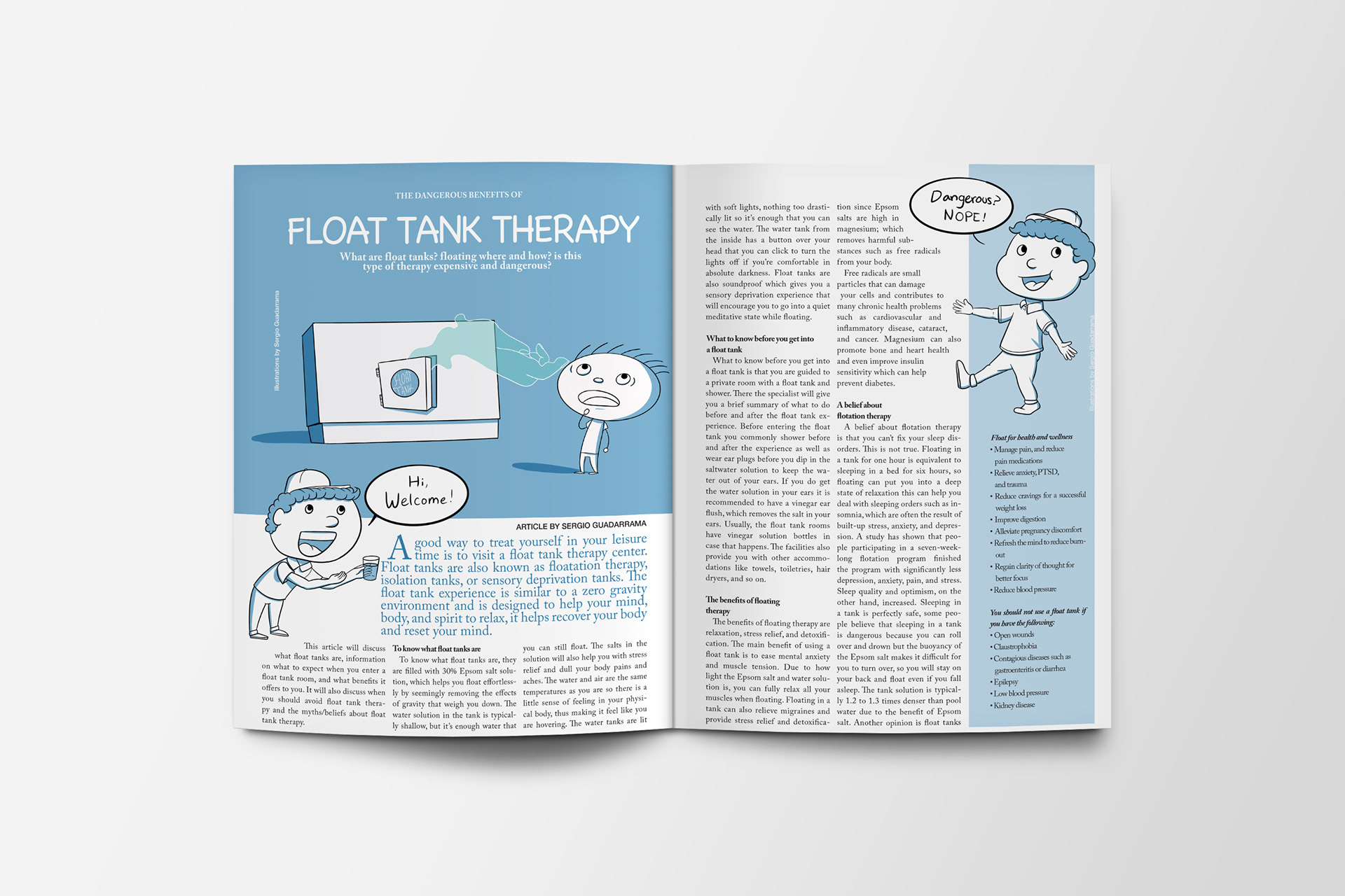
Page Layout Situational

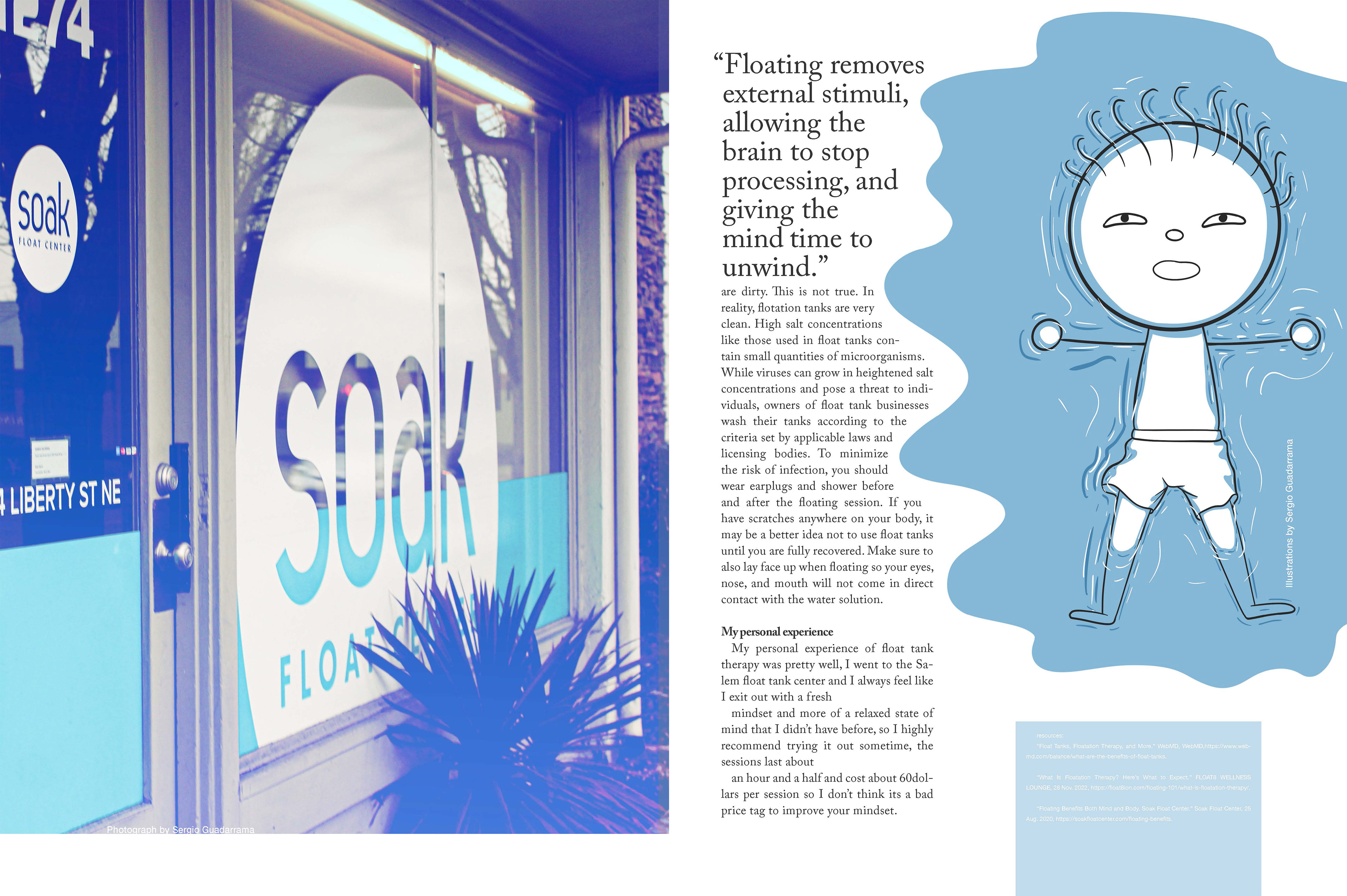
Page Layout: 2

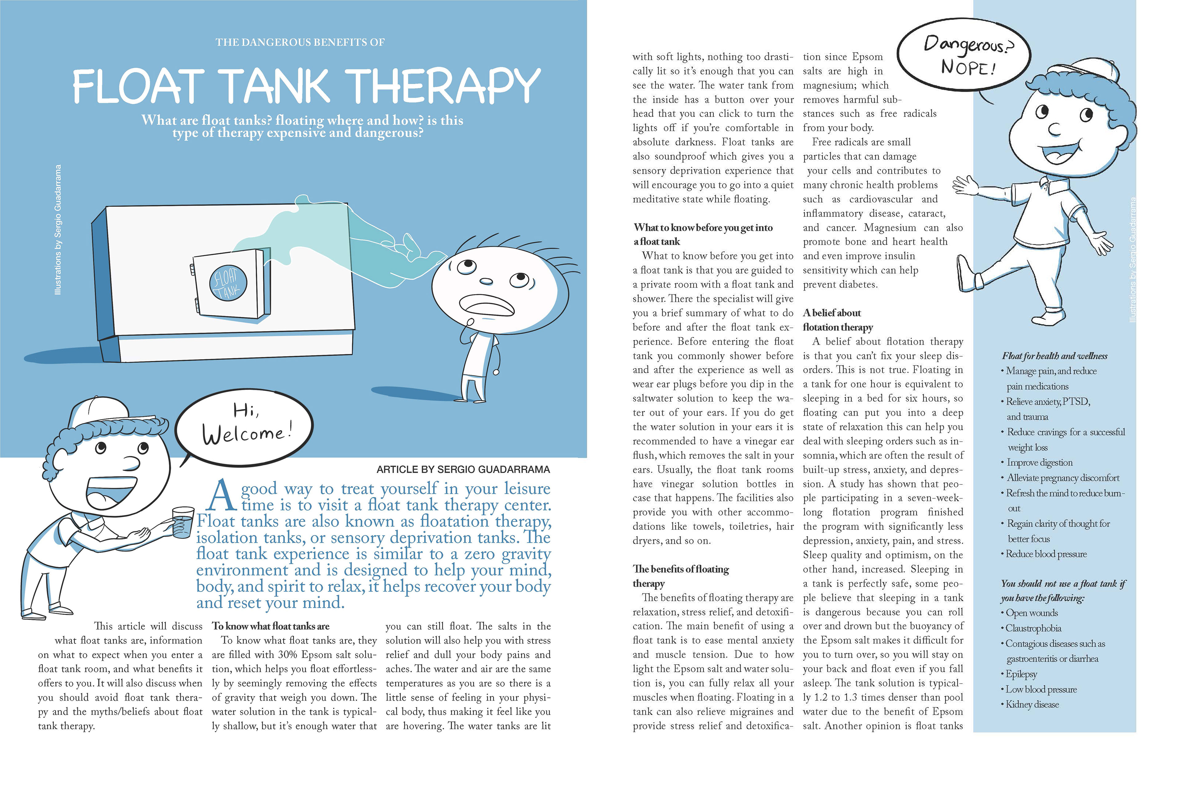
Page Layout: 1

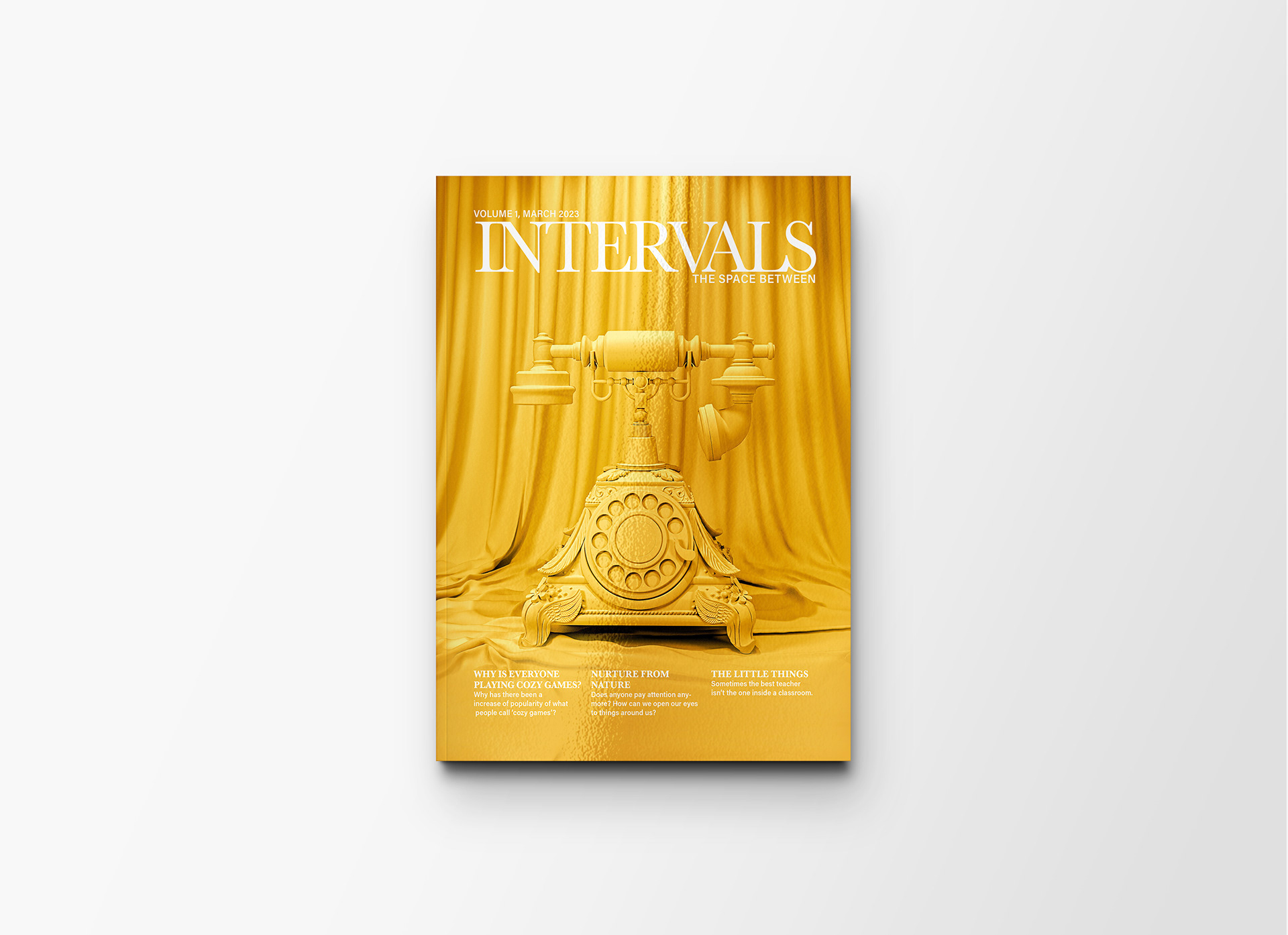
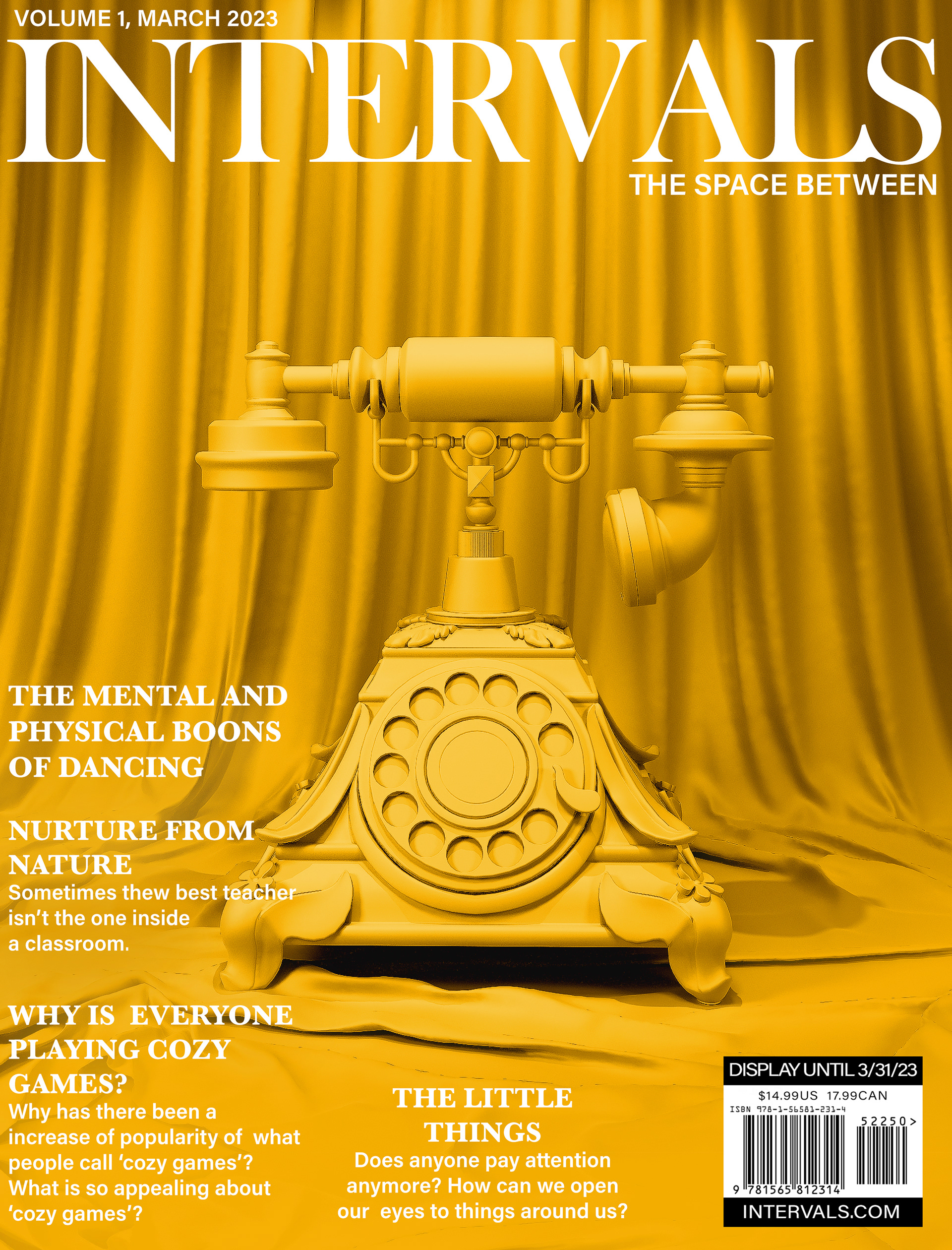
Magazine Cover

Text wrap Illustration

Layout Illustration

Title Page Illustration

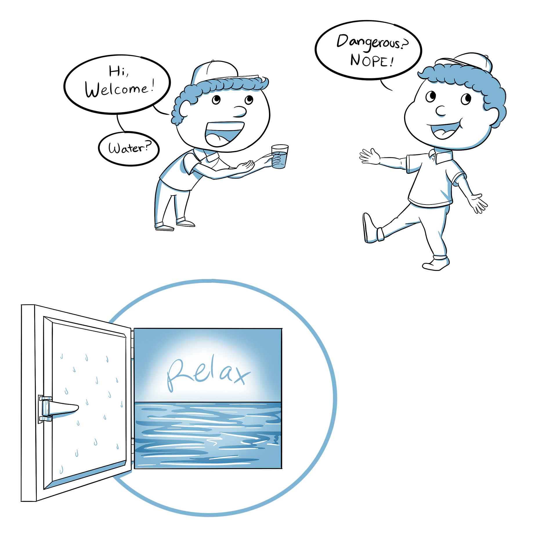
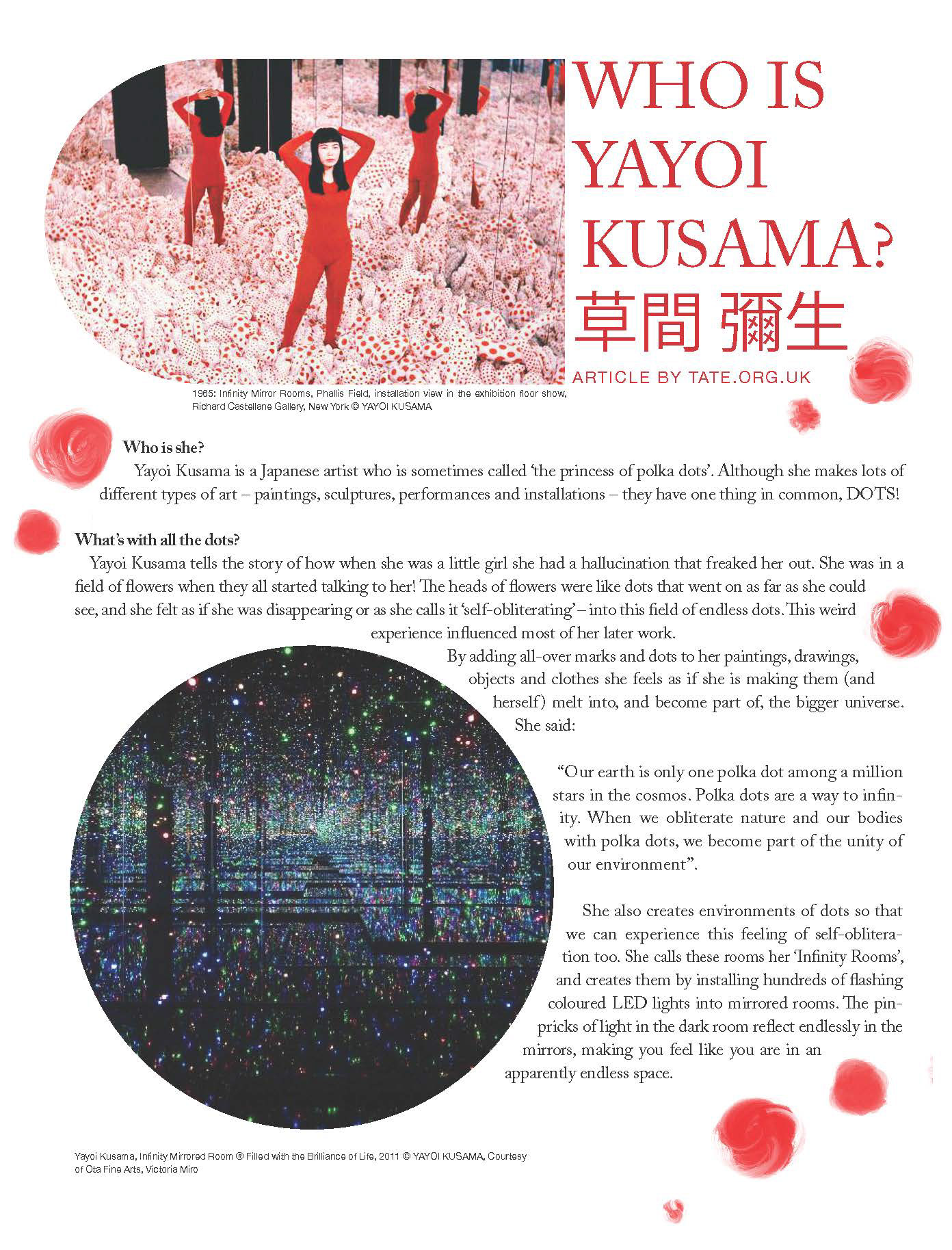
I designed a magazine cover "Intervals," inspired by the theme of time and space. The cover reflects this theme by using a phone to symbolize the constant engagement we have on our phones. Between different moments in our lives, we are almost always on our phones. For the Article that I designed and wrote, I chose float tank therapy as the topic because I’ve tried it myself and find it relaxing. The layout uses calming blue tones and wavy text to reflect the relaxing vibe of float tanks. The whole design is meant to be cohesive and engaging, perfectly capturing the chill and serene experience of float therapy. The article about Yayoi Kusama featured images sourced from Google. These images were arranged and laid out in InDesign to create a visually appealing and informative spread.
