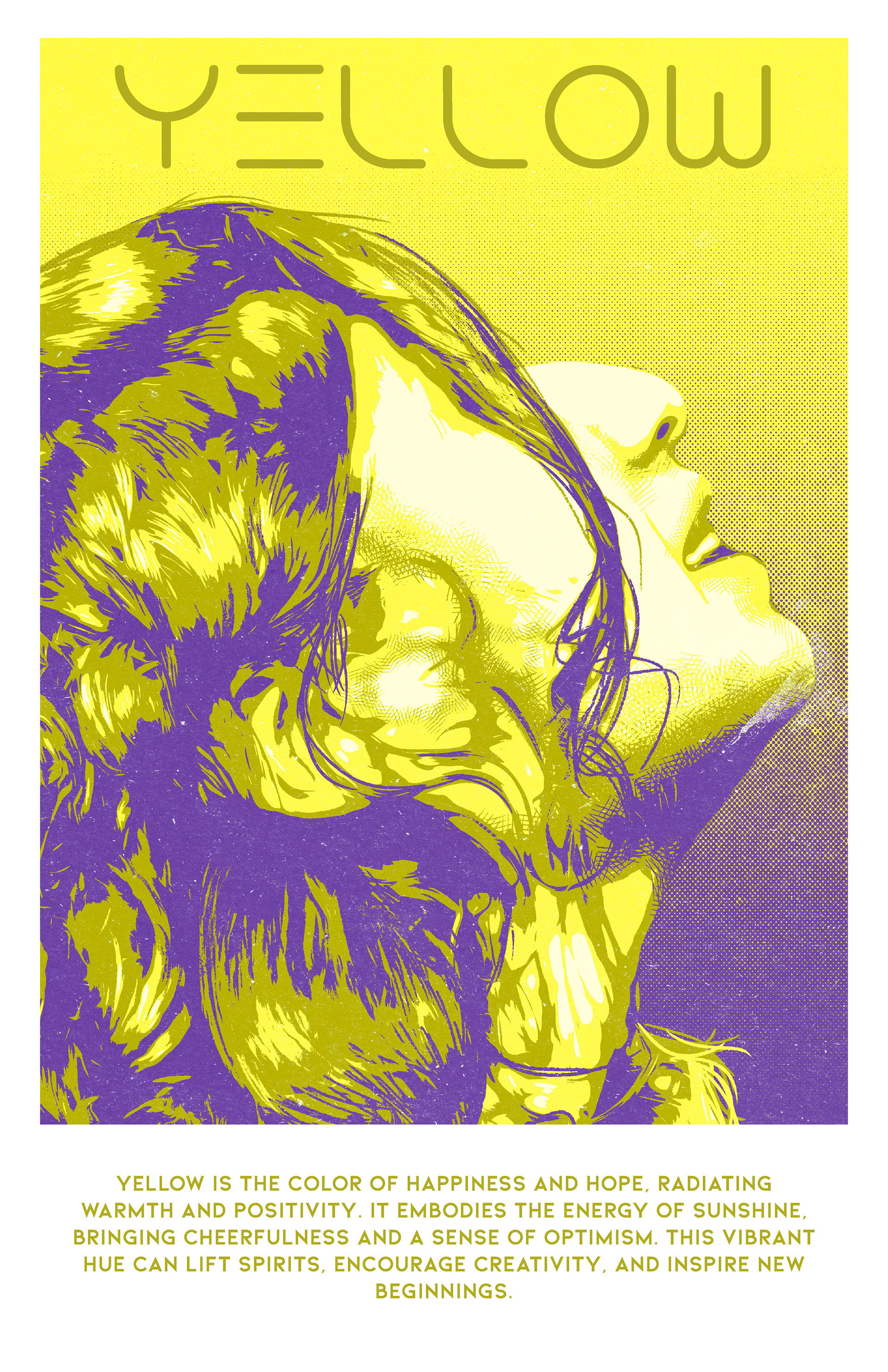
Yellow Color Poster

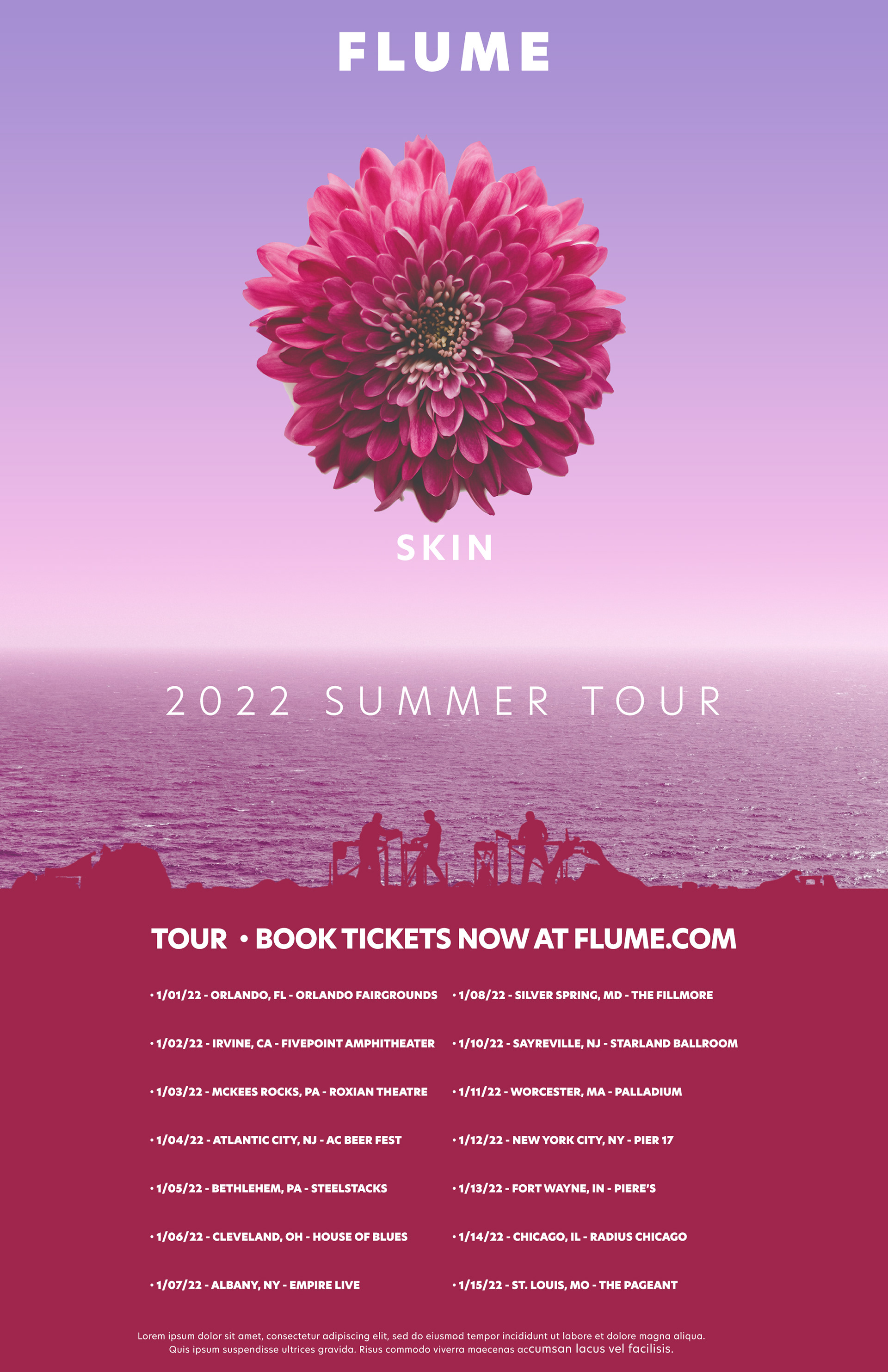
Summer Concert Poster Layout

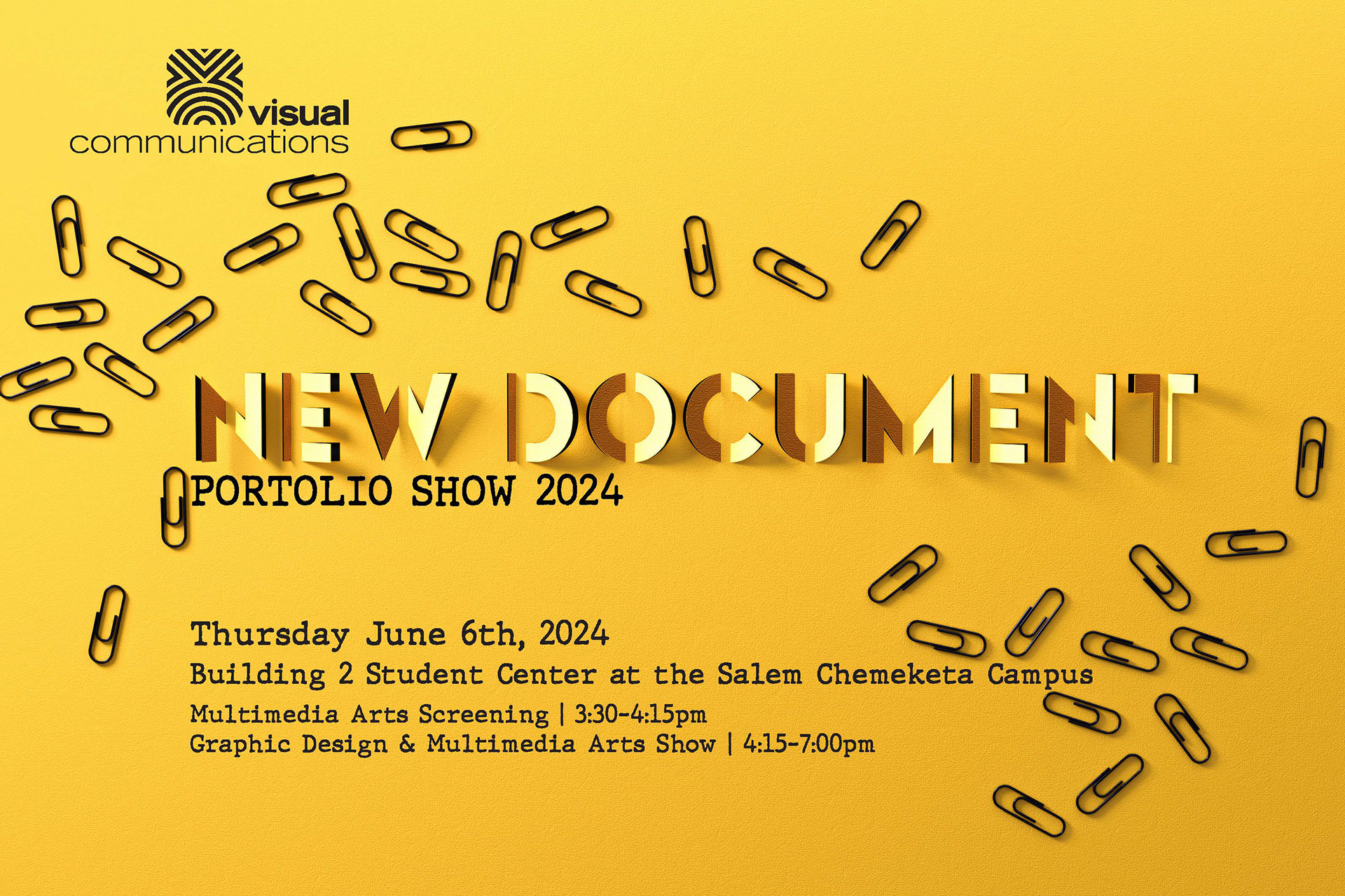
Event Invitation Layout

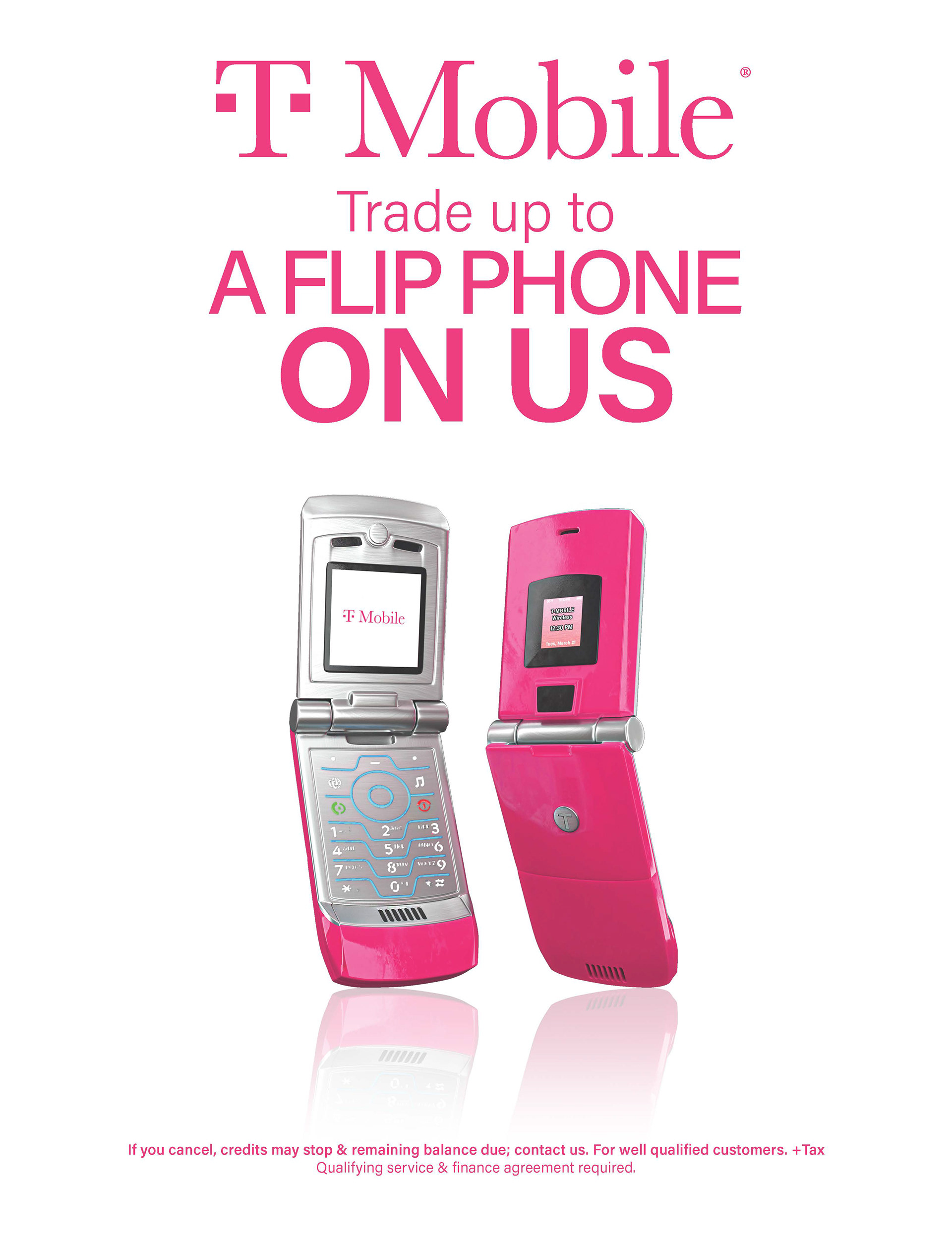
T-Mobile Advertisement Mockup

Voting Poster

In this project, I combined my skills in Adobe InDesign, Photoshop, Illustrator, Blender, and Substance Painter to create a cohesive and visually engaging layout. I started by designing the yellow color poster image. This involved enhancing a real photograph in Photoshop with detailed work using a Wacom tablet. Once the image was perfected, I incorporated it into the layout with InDesign. For the T-Mobile poster, I created a rendered image using Blender. This image was then seamlessly placed within the InDesign layout, adding depth and dimension to the overall design. The concert poster was crafted using royalty-free images to create a flowing collage. I generated band silhouettes in Illustrator and integrated these elements into the design with InDesign, ensuring a cohesive and dynamic final product. For the new document invitation, I utilized Blender to create paper cut-outs for the text and paper clips, added realistic textures with Substance Painter, and rendered the final image in Blender. I completed the layout by adding text in InDesign, resulting in a polished and professional invitation. This project showcases a blend of image manipulation, 3D rendering, and layout design, reflecting my diverse skill set and creative approach.
